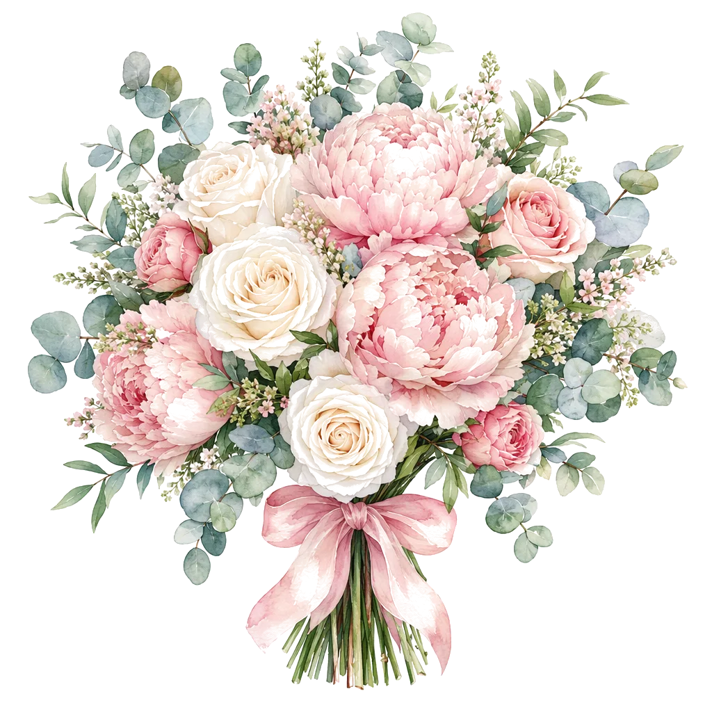
Color is not condolence. It is the room the note walks into. On a digital sympathy card, loud celebration palettes force the bereaved to manage your design before they can receive your care. Quiet palettes lower that tax. They still require careful wording, private delivery, and respect for culture — see digital sympathy flowers etiquette and messages that do not demand a reply.
DigiBouquet AI lets you Create Free Bouquet bloom by bloom, or Create AI Bouquet with a restrained mood. Credits apply only to AI generations after sign-in. Free building never spends them. Recipients open a gift link without an app. Digital does not replace funeral flowers or family customs (Emily Post on sympathy flowers).
What “quiet” means on a phone screen
- Lower saturation than party or birthday cards.
- Readable contrast for short text — soft is not illegible gray-on-gray.
- Few competing accent colors; one calm story.
- No confetti energy, neon gradients, or “celebration pack” defaults.
For general color symbolism (still secondary to relationship and culture), see flower color meanings and sympathy flowers.
Palette directions that usually land
1. Ivory and soft white
Cream, ivory, pale blush-white. Pairs with lily or soft camellia. Feels formal without freezing. Avoid pure optical white with harsh black type if the card starts to look like an invoice.
2. Muted sage and stone
Desaturated greens, warm gray, soft taupe. Suggests steadiness more than cheer. Works when you want the card to feel like a quiet room, not a garden party.
3. Pale blue-gray
Cool calm without icy distance. Keep florals muted; do not slide into bright sky-blue celebration.
4. Soft lavender (use carefully)
Can read gentle remembrance for some people; for others it is too decorative. When unsure, prefer ivory-sage over purple drama.
5. Single soft accent
One pale rose or soft yellow note inside a neutral field — not a rainbow. Accents should whisper.
What to avoid by default
- Hot pink, electric coral, saturated orange “party” packs.
- Gold glitter energy that reads as congratulations.
- Busy multi-color mixes that fight the short note.
- Overly romantic deep-red rose stacks when the relationship is not that story.
Culture varies: some traditions favor white, others have different funeral color codes. Family instructions beat any list on this page. When physical arrangements are requested, florist networks and cutoffs still apply (1-800-Flowers, Teleflora, same-day rules) — digital palette tips are not a substitute for those customs.
Free path: control every bloom
Create Free Bouquet is often best for sympathy. You can keep stems limited, greenery soft, and reject anything that brightens too far. No credits. Take the extra minutes; rush is what pushes people into loud defaults.
Suggested free direction: lily + camellia + restrained greenery; or lotus with soft neutrals when dignity matters more than fullness. Message stays two to four lines.
AI path: prompt the volume down
If you use Create AI Bouquet, describe mood before flower lists: “soft neutral condolence,” “muted sage and ivory,” “quiet memorial, no celebration lighting.” Avoid “bright,” “party,” “vivid.” Put the real note in message fields. Starter credits after sign-in; generations spend credits. Soft style language also appears in soft vs bold flower styles and path choice in free vs AI bouquet.
| Palette | Feeling | Watch-out |
|---|---|---|
| Ivory / cream | Formal calm | Harsh pure white + black can feel cold |
| Sage / stone | Steady presence | Too much green can read “get well,” not condolence |
| Blue-gray | Cool quiet | Do not brighten into party sky blue |
| Pale lavender | Gentle remembrance | May feel decorative; know the recipient |
| Hot celebration packs | — | Skip for sympathy by default |
Pair palette with channel and note
Private gift link only. Preview on your phone (FAQ). If type disappears into a foggy background, raise contrast slightly — quiet is not unreadable. Wording guide: sympathy messages that do not demand a reply.
A simple rule of thumb
If the palette would look at home on a birthday group post, turn it down. If it looks like a soft room someone can rest in, keep it. Then write a short note that does not demand a reply, and send one private link. Google’s helpful content guidance is our bar: useful decisions, honest product limits, no aesthetic advice pretending to be grief counseling.